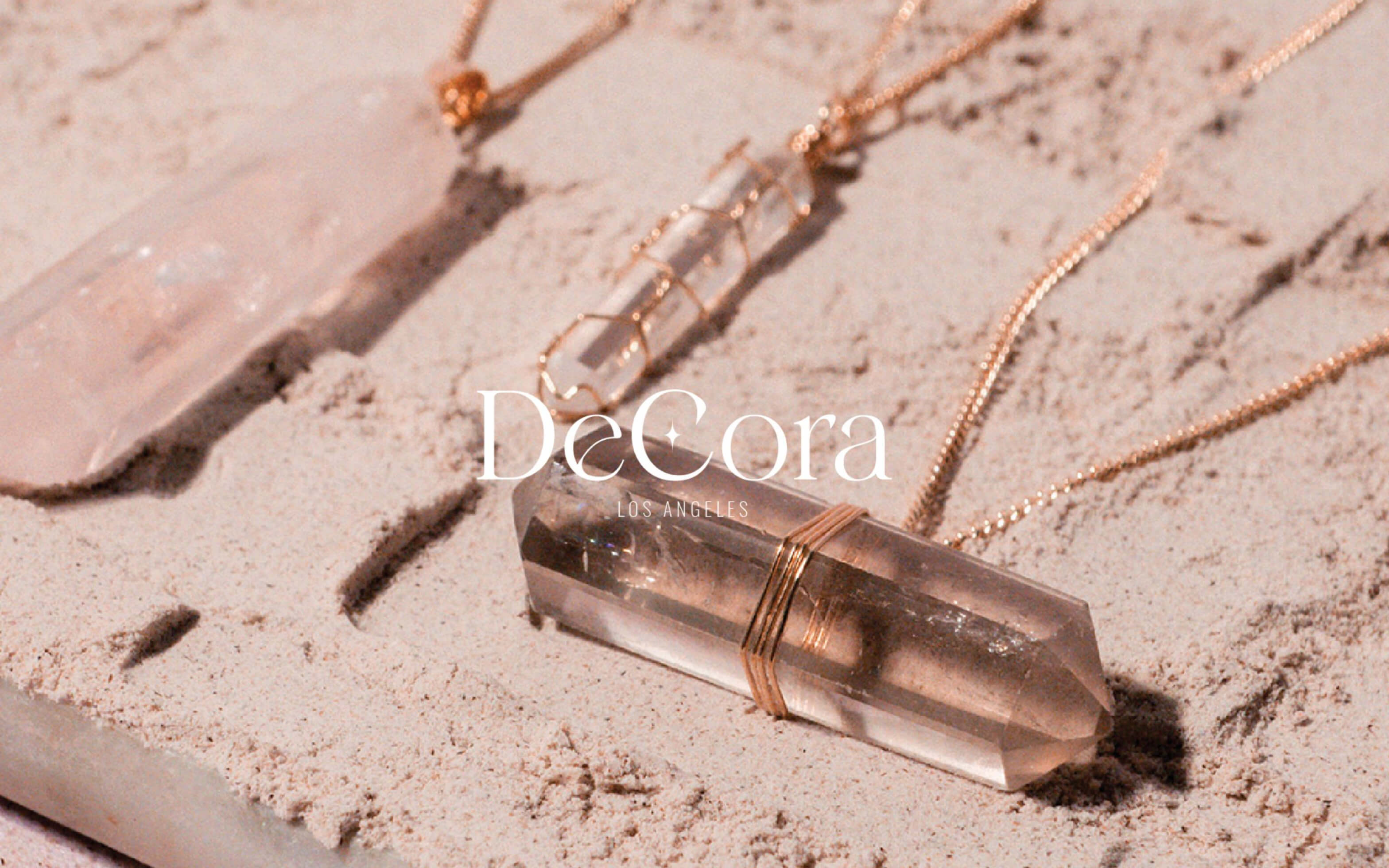
DeCora
Brand Identity Design | Packaging Design
Challenge
DeCora was a brand that we build from the foundation, we were only presented with the idea of creating a product with spiritual meaning and that it was a long childhood dream of the client to create something from the heart. Therefore we gave it the name DeCora, which means from the heart.
Solution
We envisioned DeCora with the client’s wish in mind, to design something that is from the heart. We created a brand that represented the energies of life surrounding us, for people who have a deep sense of spirituality and lust for life. The brand itself was created as the embodiment of spiritual healing and mysticism in all things.
Summary
- + Branding
- + Brand Book Creation
- + Package Design
Branding
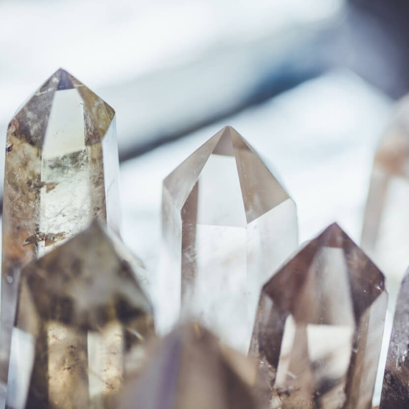
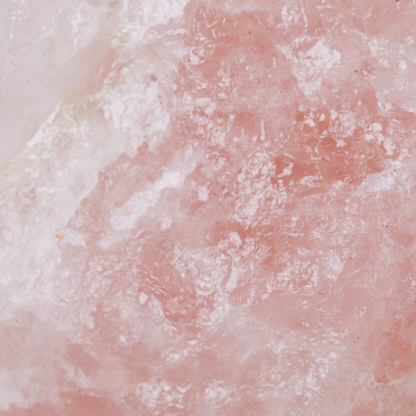
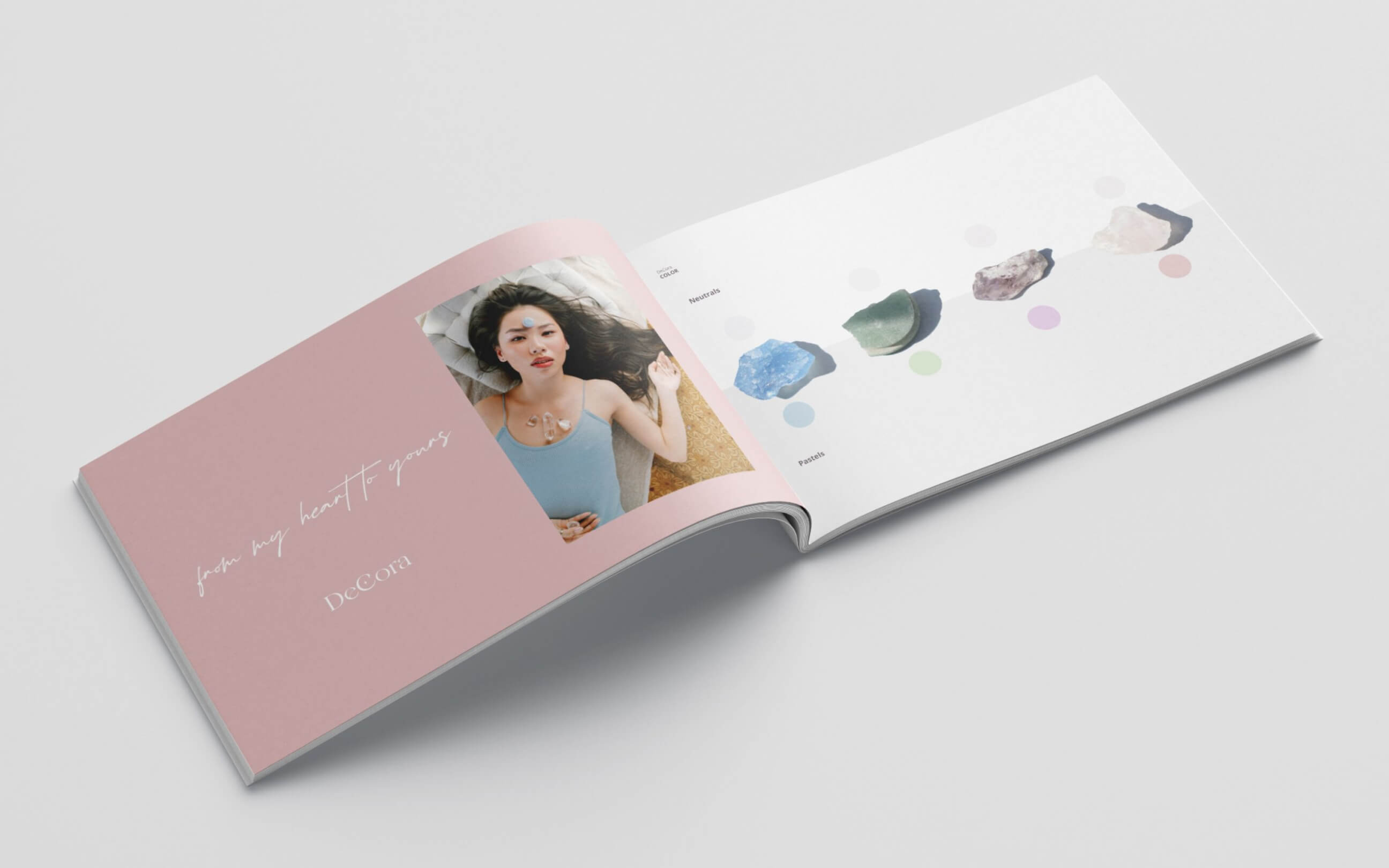
We used a visual language corresponding to life’s mystical aura, in a way portraying how you can harness the power of the crystals, all depicted with smooth flowing lines and appealing, calming structure. The coloring and graphic elements are derived from the most common crystal colors.
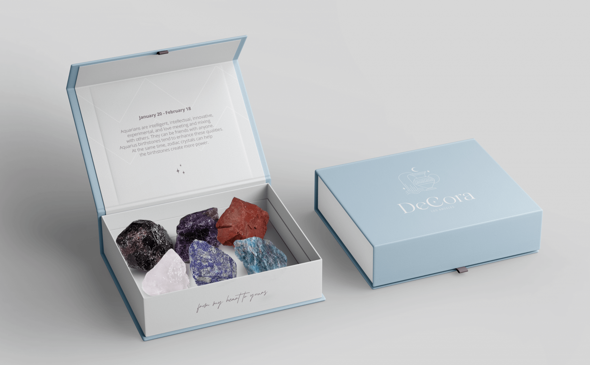
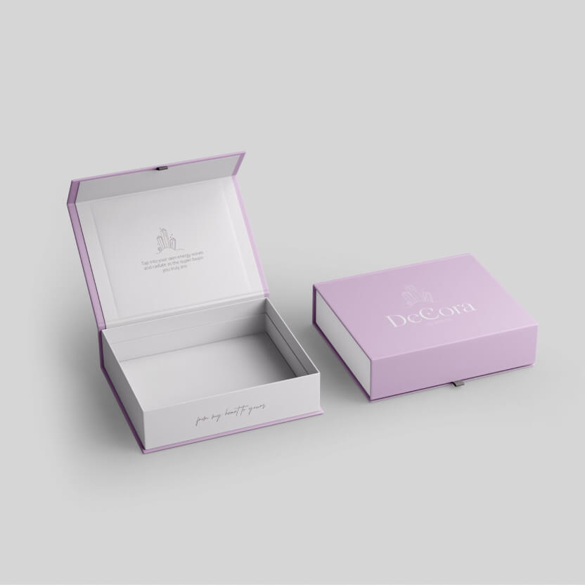
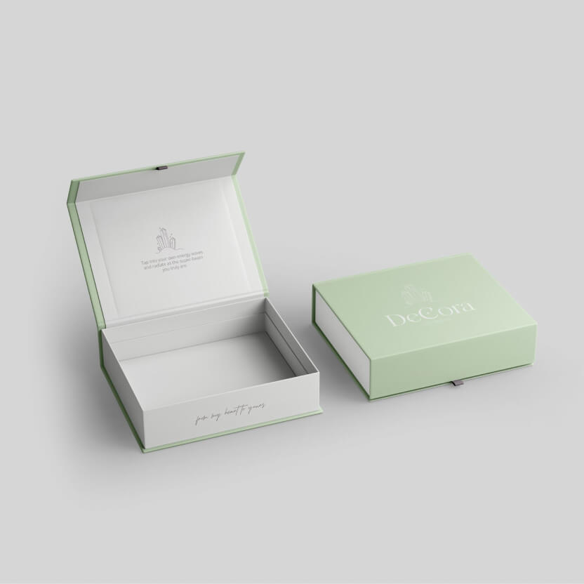
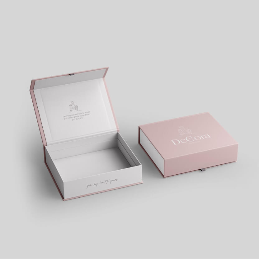
Packaging
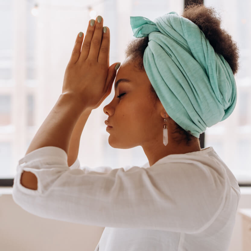
The packaging design tells a story of healing, restoration, spirituality, and calmness. The idea was when the audience would take a look at the packaging design they would instantly feel a strong spiritual connection with DeCora, and embrace the oneness they share with the brand.
Results
The client was starstruck and overwhelmed by the design, which was all thoroughly and visually depicted in a brand book we created for her. The crystalline serenity the audience is supposed to feel was fully translated through the design and visual language.